スポンサーリンク
実用的で、アクセスしやすく、美しいUIを創るとき、デザインはちょっとした微調整で改善できます。
UI&UXのちょっとしたチップスを5つお伝えします!
(この記事はUXCollectiveの記事を元に作成しています。)
スポンサーリンク
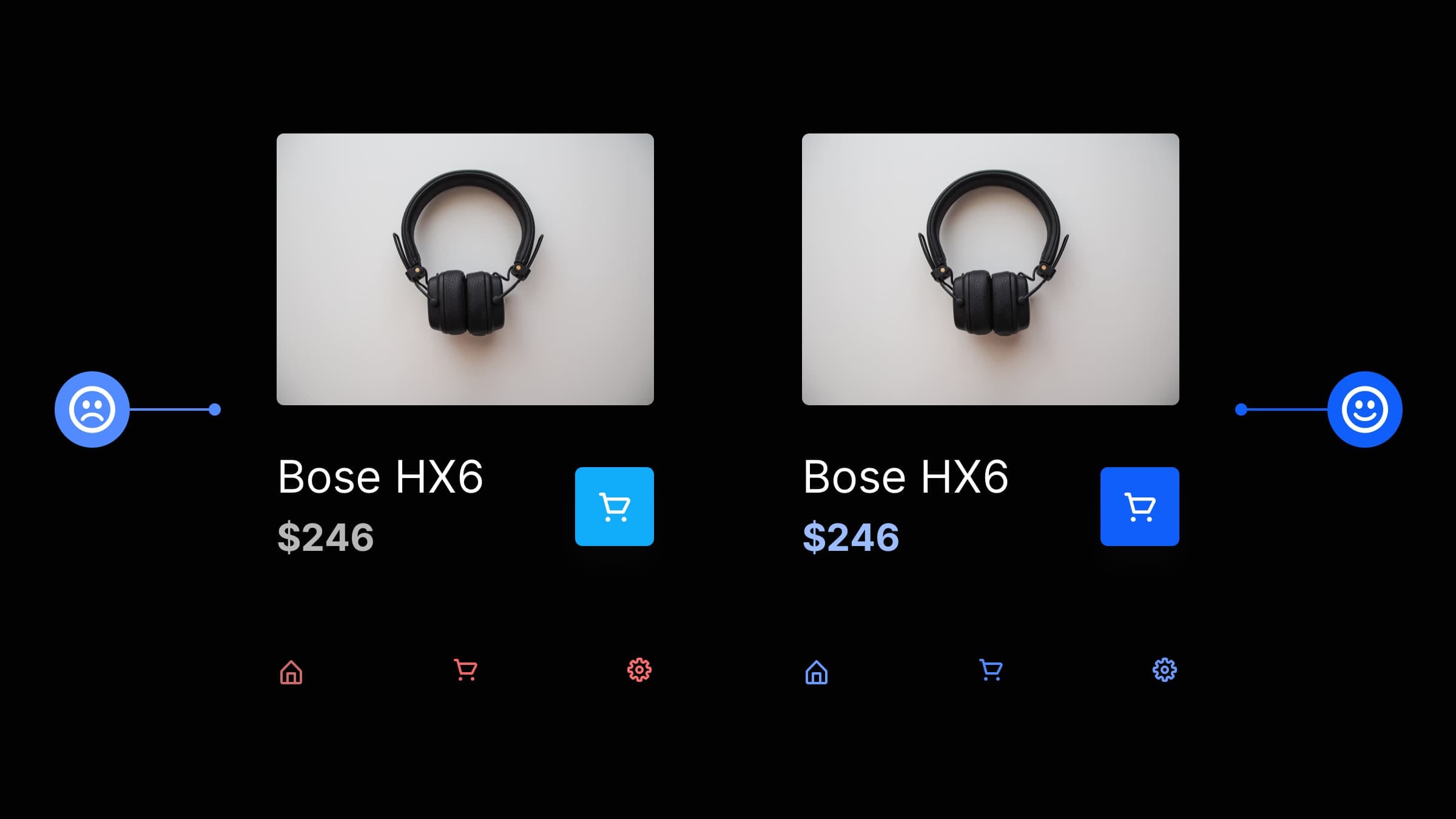
デザイン要素と一貫性を持たせる
まずはサンプルを見てみましょう。
右の方が洗練されているように思いませんか?

私たちは、習慣的な生き物であり、おなじみの方法で提示されることを期待します。
レイアウト、アイコン、色、ボタンなど例があります。
一貫性を持ち、混乱を減らし、UXの改善をしましょう。
- ナビゲーションをスクエアから楕円へ
- キービジュアルをスクエアから角丸へ
- 「VIEW FULL RANGE」の文字をすべて大文字から、先頭文字のみ大文字へ
ホワイトスペースをたっぷり使う
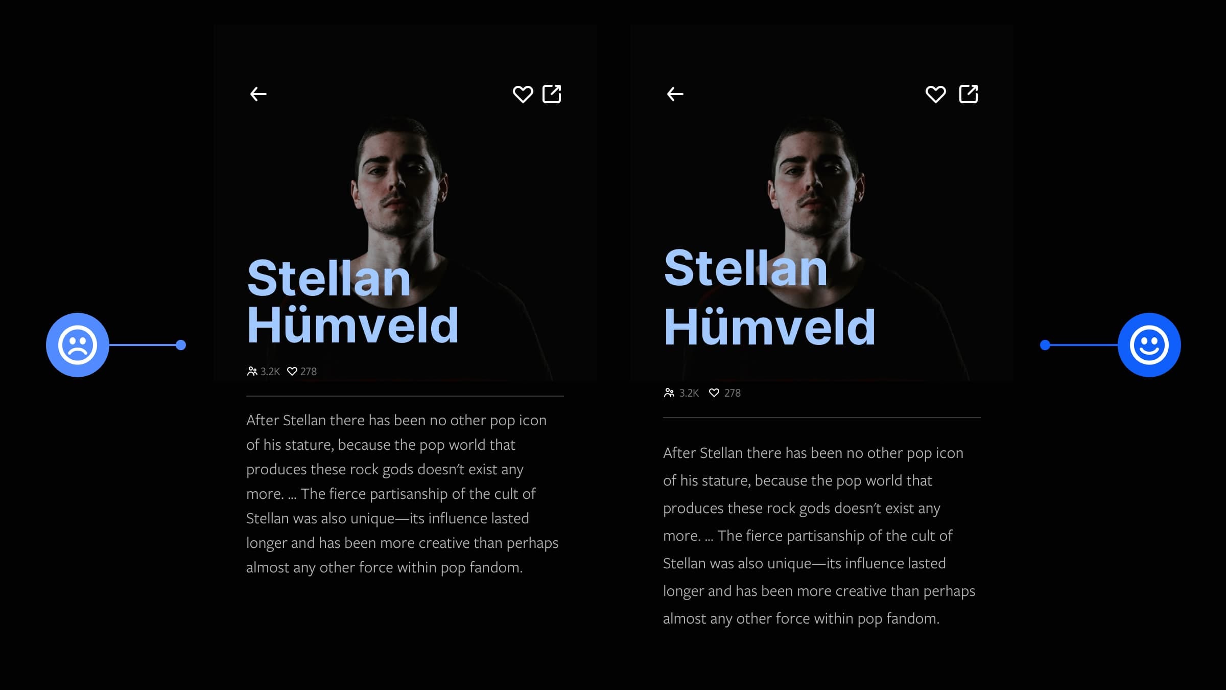
ホワイトスペースを惜しみなく、節度を持って、うまく使いましょう。
- 右上のハートとブラウザ立ち上げの間隔をあける
- 「3.2K、278」のアイコン群をキービジュアルから下げる
- テキストの行間をあける
最初の段落のスタイルを定義し、ユーザーを引き込む
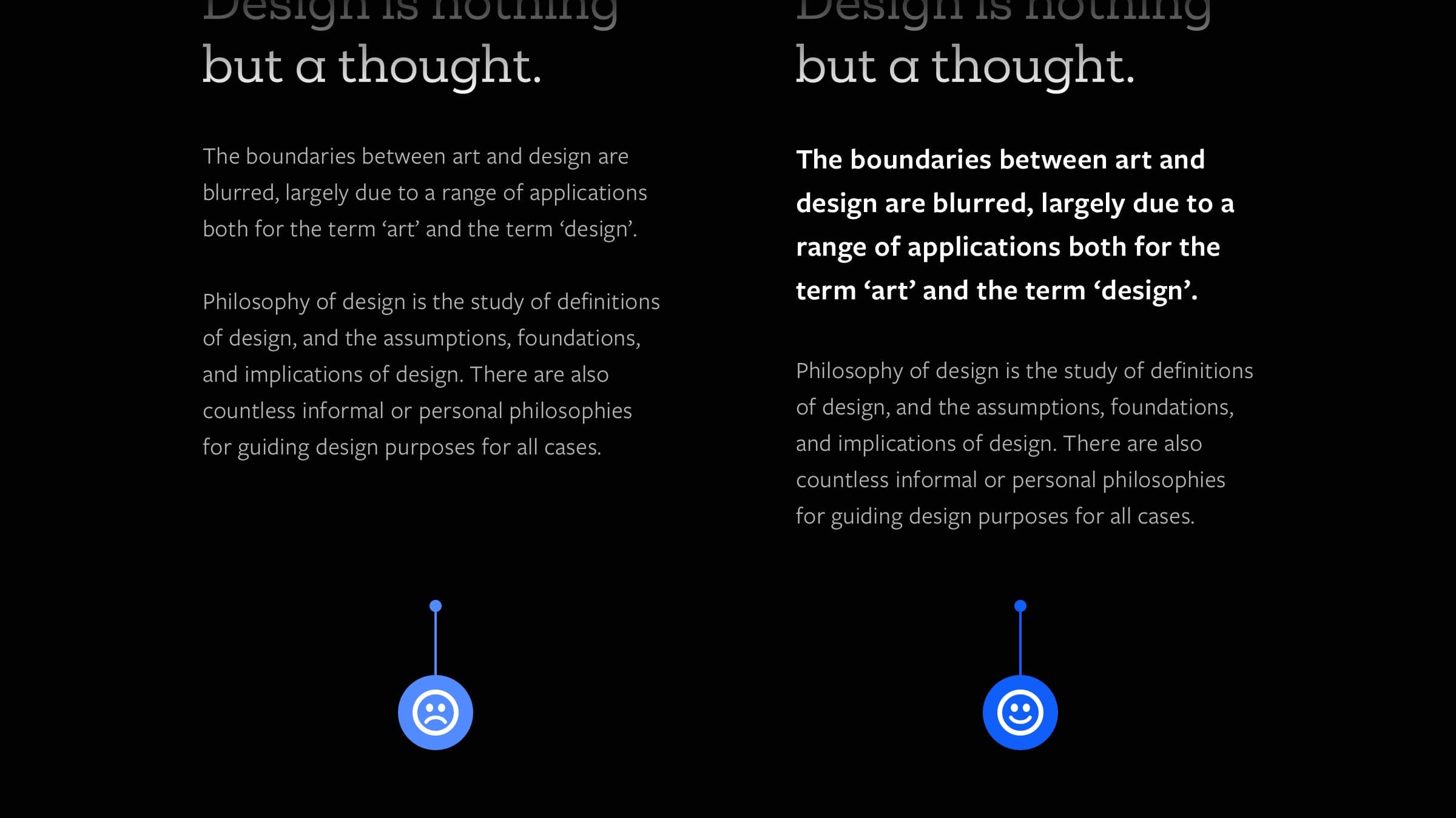
最初の段落は、記事やブログを読んでもらうために重要です。
違うフォントサイズ、文字の高さ、横幅、色により第一印象を改善できます。
- フォントサイズ
- 文字の高さと横幅
- 色
短い段落・文章を使う
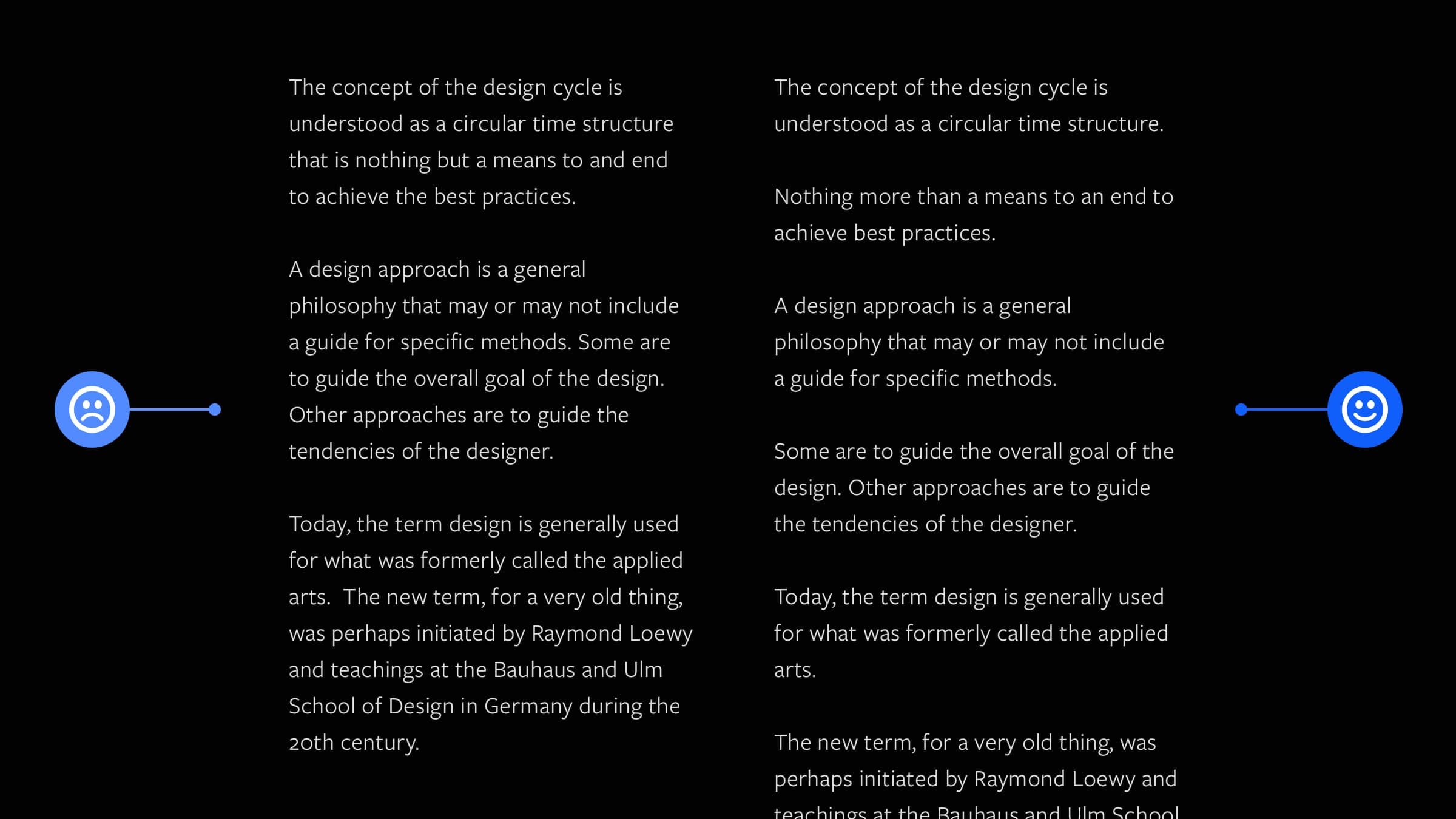
長い文章はできる限り短くパンチの効いた文章にしましょう。
- 文章を短文に変更
- 一文ずつ段落を分ける
カラーパレットを定義し、デザインを均一にする
より美しいUIを創るなら、カラーパレットを定義しましょう。
いろんな色を詰め込みすぎるのはやめましょう。
スポンサーリンク
スポンサーリンク